Focal point cropping version 3.1
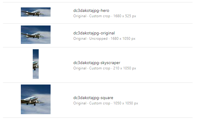
A small but impactful update on my focal point cropping implementation for Content Hub, thanks to a suggestion / feature request from Jorgen Jansson from Creative Folks (thanks again for your wonderful contributions Jorgen!): I have added the possibility to name your public links instead of using the ratio itself for the name of the cropping. This makes it easier to work with the different public links for the team of UX experts and front-end developers, as they now can choose to get a uniform naming between their designs, code and public links coming from the Content Hub CDN.
Redesigned cropping configuration
To be able to implement this I decided to refactor my cropping definition configuration, leading to a breaking change if you’re coming from earlier versions of my Focal Point Cropping module. The optional boolean to use the original image for the public link moved to a required boolean as the first parameter, but it also flipped! Just because this makes more sense when you explain the list of parameters linguistically. The first parameter now indicates if you want to crop. When you set that to false, it will use the original image for the public link. If you set that to true, you are telling the script to actually apply the cropping definition, and can proceed to configure your cropping requirements in the following parameters.
Like the previous version, the first two parameters are for the exact dimensions in width x height, and the second set of parameters is for configuring a ratio, which will then crop to the largest possible dimension of that ratio within your original image. You should use transformations to further downscale your image to the desired dimensions from there. This gives you way more flexibility and better performance at the same time. Lastly, I have added a new optional string parameter that you can use to override the default name of the public link, like so:
// configure auto-generated croppings
var croppings = new Dictionary<string, CroppingDefinition>();
AddCroppingDefinition(false, 0, 0, 0, 0);
AddCroppingDefinition(true, 1280, 960, 0, 0);
AddCroppingDefinition(true, 1280, 430, 0, 0);
AddCroppingDefinition(true, 320, 100, 0, 0);
AddCroppingDefinition(true, 400, 600, 0, 0);
AddCroppingDefinition(true, 0, 0, 3, 1);
AddCroppingDefinition(true, 0, 0, 16, 9);
AddCroppingDefinition(true, 0, 0, 4, 5);
AddCroppingDefinition(true, 0, 0, 16, 5, "hero");
AddCroppingDefinition(true, 0, 0, 1, 5, "skyscraper");
AddCroppingDefinition(true, 0, 0, 1, 1, "square");
In future versions, I might refactor this even further, because I also do not like the mixed dimension and ratio parameters, so I will probably move to different cropping types. But for now, this works like a charm and you can easily acquire the desired result with a small adjustment to your cropping configuration:

I like the outcome and it does make the public links more meaningful and easier to read. You can find this new version on my GitHub repository, together with the installation instructions in the README file of the “React page components” folder: https://github.com/robhabraken/content-hub-focal-point-cropping.
Also, since the React update, the module has been tested extensively, and is used in production for at least one Content Hub instance already, so I now longer would mark it beta and would say it is safe to be used in production.
Please note that from now on, new features will only be implemented in the React version of my Content Hub integrations. Hence, the Knockout script did not receive this update and is merely persisted for backwards compatibility. If you did not yet upgrade to 4.2.x, please consider contacting your Sitecore representative and arrange the update to the latest version of Content Hub.
